Disclaimer: This is NOT an end-all review of Glasses-free 3D, just a preliminary assessment based on current technology.
Today I tried a Nintendo 3DS for the first time, and got to experience one of these amazing new screens, but my first impressions are not good. Basically, as I understand Glasses-Free 3D (from hereon called GF3D), it requires two screens slightly offset, and it displays a slightly different image on each one to trick your eyes into slightly crossing, then your brain reinterprets the eyes-slightly-crossed-image from the slightly-offset-double-screen as a new image which appears 3D. However, as far as I could tell, it is not possible for GF3D to "pop out" of the screen, it only allows you to "stare into" the screen, but I could be wrong on this.
I located the 3DS in my local Best Buy, and began playing whatever piece of shovelware it was running, it was something to do with flying around an island, but I didn't really care. The screen was in 2D, and I pushed the slider all the way up for max 3D, and instantly my eyes were overwhelmed. Then I took it down to just under halfway, and the effect was amazing. I really can't describe it, it was 3D, right in front of me, but it didn't seem cheesy or forced, just a very natural sense of depth. I played the shovelware for a few minutes, continually trying to get myself to acclimate to the maximum 3D, but to no avail. The best I could do was to get 2 inches from the screen and then it almost looked alright, but that was fine, the halfway setting did its job marvelously. If you are wondering, "Is 3D really possible without glasses?"..."Yes! Yes, it is!" I personally found it to be more enjoyable than the movie theater pop-out-of-the-screen stuff.
But now for the bad news, which unfortunately outweighs the good news. I've already explained that GF3D requires that your eyes be just slightly crossed, and this is quite fatiguing. Withing 5 minutes my eyes hurt; now I am no objective sample group, but I am a potential 3DS owner. I cannot buy a 3DS if the 3D makes my eyes hurt in 5 minutes with the slider at less than halfway. Don't get me wrong, I am not faulting Nintendo for my issues with GF3D, the current technology causes my eyes to quickly fatigue and begin to ache, and that is not their fault. But now for the other problem, focal points. I have seen many reviews slamming the GF3D for having an incredibly precise working range: that you must look exactly straight on at the screen, and be a very specific distance away. For me at least, the problem is nowhere near that bad: I did have to look mostly straight on, but I could tilt a bit, but only just a bit, and still see the screen alright. And as for focal point, it does seem related to the strength that you have the 3D at, but was pretty flexible, as for me the range at which i could perceive the 3D was a few feet, and didn't seem to be any problem.
In summary, GF3D has two main problems, and one big advantage: it causes eye fatigue and pain VERY quickly, it must be viewed nearly straight on, but it does, undeniably, give a 3D effect. For me the viewing angles aren't a deal-breaker, but the eye fatigue IS. I am disappointed with Nintendo for releasing a GF3D device while the technology is so young and still causes so much eye strain. I am equally dissapointed with phone manufacturers preparing to release devices with GF3D displays as well, the novelty of the tech will sell the device, but then people will really see what they've gotten into. The technology simply isn't there yet, and who knows if there ever will be a way to do GF3D without eye strain. As much as I hate 3D glasses, maybe they are truly necessary, only time will tell.
Thursday, March 31, 2011
Monday, March 21, 2011
[UPDATED] A Quick Update on Chrome OS
Overall, Chrome OS has continued along much as could be expected, with lots of small bug fixes and refinements. Today I would like to just cover a few larger changes from the past 3 months.
This is probably being too hopeful, but I would like to do my analysis of Chrome 10, Internet Explorer 9, and Firefox 4 as soon as this weekend, as the release of Firefox 4 and IE9 marks the first real competition from them in a while.
Further reading:
http://chromeos-cr48.blogspot.com/
- Improved Theme support: Previously the top bar of Chrome OS was forced to be black, no matter what theme was present, the tabs themselves could be covered, but the background could not be. It is really nice to have the theme now impact the entire interface.
- Quicker Boot-Up speed: In my completely unofficial tests, Chrome OS boot up is now only 7 seconds. The sign in screen is now nearly instant if you use a profile which has no user-specific stuff to load (themes, extensions, etc. but more on that later) but still takes the customary 5 seconds if you (like me) have themes, extensions, and bookmarks to sync and load.
- Effortless syncing: Themes, Extensions, Bookmarks, Passwords, Form Data, History, and even data from scratchpad notes are all synced to your google account quickly and easily on all computers you use.
- Adobe Flash Player 10.2: Flash 10.2 brings performance improvements for all computers but they are most notable on low-powered netbooks. Previouly, my Cr-48, like any netbook, could only play 360p content smoothly, 480p content was stuttery, and 720p was just impossible. Now with 10.2 480p is perfectly watchable and 720p is somewhat stuttery but bearable. Go Adobe!
- [ADDED] Improved Right Click: In my initial review I said that there was only tap-to-click for single finger clicking, but now you can tap with two fingers for right click.
This is probably being too hopeful, but I would like to do my analysis of Chrome 10, Internet Explorer 9, and Firefox 4 as soon as this weekend, as the release of Firefox 4 and IE9 marks the first real competition from them in a while.
Further reading:
http://chromeos-cr48.blogspot.com/
Friday, March 18, 2011
Call of Duty vs. Team Fortress 2...FIGHT!!!
If you want me to get into that hopelessly pointless "games as art" debate going around, this is as close as you're going to get. But actually, this is an encomium (praise of something) that I wrote for a school assignment. It is framed as a praise of Team Fortress 2 as well as a condemnation of Call of Duty. So, let's get to it now.
~~~~~~~~~~~~~~~~~~~~
Encomium on Team Fortress 2
“All it takes to change the world,” said Captain Price, “is one good lie and a river of blood.” At first this may seem like a profound statement, but as with all things, we must consider the context. This quote comes from the intro to the final level of Call of Duty: Modern Warfare 2, and represents what could be called the most inspiring moment in the game’s cheesy, convoluted plot. In a nutshell the real problem with Call of Duty is that it takes itself seriously and tries to present a real life war scenario, but is stuck in a tight development schedule and is forced to resort to being a cheap adrenaline rush. Today I would like to introduce a game which is in many ways a complete opposite to Call of Duty, and a fun escape from reality. After all, video games aren’t actually real, so why must they keep trying to be? And now I present to you the completely unrealistic, anti-serious, and all around cartoony game, Team Fortress 2.
History of Team Fortress
It all begins with Valve, a game company founded by two ex-Microsoft employees, who became widely recognized for their first game, Half Life. Half Life is an apocalyptic, sci-fi first person shooter and physics puzzle game. Although on its own it is recognized as an outstanding game, and one which pushed the bounds of game storytelling, it also had one huge feature that is essential for long-term success. This feature is mod support. Mod support means that a game’s core is able to be easily modified and used to create other games using the same core, this is known as a “mod.” Many Half Life mods were released by fans, the most popular one being Counter-Strike. The mod was so popular and successful that Valve purchased Counter-Strike and continues supporting it with regular updates even today. Another popular Half Life mod was Team Fortress Classic. Team Fortress Classic was originally developed as a mod for Quake, and later Quake World, and called Quake World Team Fortress. Valve was so impressed with the mod that they hired the 3 creators, Robin Walker, John Cook, and Ian Caughley, to port the mod to Half Life and release it as the retail game, Team Fortress Classic.
Valve announced that it was then developing a sequel, to be called Team Fortress 2. Initially, it was planned to be a sequel which simply expanded on Team Fortress Classic gameplay, and was to be released “soon.” What made Team Fortress so unique was that it focused on cohesive teamwork, with different duties assigned to the 9 distinct classes: Scout, Soldier, Pyro, Spy, Heavyweapons Guy, Demolition Man, Combat Medic, Sniper, and Engineer. Each class had different strengths and weaknesses and required a completely different play-style to be successful. Team Fortress 2 was only meant to refine this formula, namely by adding a player in the sky who was to help direct the different players below. This never happened, for years Team Fortress 2 was never released, and it was widely considered “vaporware,” an intriguing concept which would never see the light of day. Then, after nine years of development, Team Fortress 2 was released in October 2007, but it was not like anyone had expected it to be. Unlike Team Fortress Classic, or most any other shooter game, Team Fortress 2 does not have realistic graphics or physics, and the overall battle scenario is not plausible in the least. After 9 years of development Valve had made a game whose only similarity to its humble mod origins was the 9 class layout.
Gameplay
Any combat-shooter game is expected to at least try to mirror reality. Call of Duty, for instance, gives you real weapons, a somewhat sound plot, a multitude of friends, a larger multitude of enemies, and an even larger battle-field. Beyond just that, it has to do its best to justify why you are doing what you are doing as well, commonly resorting to a WWII setting or a modern nuclear war. And as for Team Fortress Classic, well in that sense it had an identity crisis, the graphics and physics were that of a typical battlefield, but the weapons could be considered “experimental” at best, and “completely absurd” at worst. So in the midst of serious shooter games, which try and supply a sense of excitement by constant attempts to justify the actions on screen, there is Team Fortress 2. Team Fortress 2 still has 9 distinct classes, though much more polished and balanced, but now looks like the pixar movie: The Incredibles. And now the nine class layout is sorted into a neat triad of triads: in offense there are the scout, soldier, and pyro; in defense there are the demoman, engineer, and heavy; and in support there are the sniper, medic, and spy.# It lets a Soldier “rocket jump,” or jump and fire a rocket at his feet, to reach great heights, with no significant health penalty. And there is also the Heavy, who has a personal minigun named “Sasha,” or the Medic, who fires syringes at enemies. When the Demoman isn’t firing flourescent grenades, or placing “sticky bombs,” he is drinking from his liquor bottle, on the battlefield. The Engineer can quickly deploy and upgrade automatic sentry guns, and even teleporters for transporting teammates across the map, while keeping watch for the Spy, whose “electro-sappers” can take down all his devices in mere seconds, and whose butterfly knife can kill him instantly with a backstab. The Sniper can literally pin you to the wall with an arrow, and the Scout can double jump right over you. The Pyro simply goes berserk with a flamethrower as he mumbles through his gas mask, but watch out, because he can sneak up behind you and assault you with a garden rake, called the “backscratcher.”
As though the classes and their weapons weren’t crazy enough, then there are the objectives, which are fairly devoid of meaning, and make you question why two groups of arch-enemies, Reliable Excavation Demolition (RED), and Builders League United (BLU), would build their “bases” a matter of feet apart. The answer to all this absurdity is simple: fun. If games aren’t real (which they aren’t), then why must they pretend to be real, if being crazy is so much more fun? Aren’t games supposed to be fun, and if realism is preventing a fun experience, why not abandon realism altogether? Team Fortress 2 is Valve’s answer to these questions, and I think you will see that their answer is correct when I compare it to the most reputible “realistic” game, Call of Duty.
Call of Duty aims for the most realistic experience possible with its core design principles: photo-realistic environments, and intense, fast-paced, “do or die” action sequences. Thus, the campaign missions default to typical stereotypes, such as “small but important job in a much larger war,” where you may have to take down a group of 3 anti-aircraft guns, or “supersoldier in the midst of a massive, bloody battle,” where you and 10,000 other soldiers must take back the capital city. But in the midst of staging these “realistic” scenarios, the developers figure out that having to go through the same process to destroy 3 AA guns, or dying along with thousands of others over and over and over again may not be quite as fun as they had hoped. So they try and enhance these mission with slow motion moments where you miraculously free a group of hostages in the most random places, or are given insane amounts of weaponry to make the massive, bloody battles easy as butter to slice right through. These quick fixes to a fundamentally boring game make it into nothing but a cheap adrenaline rush.
However, Team Fortress 2 actually has fun objectives, which aren’t governed by the assumption that games must be plausible. You can try to gain possession, or maintain possession of tactically meaningless locations marked by a circular metal plate and hologram, or you can push an oversized bomb cart along a rickety old train track that culminates with its detonation in a large pit. You can even battle for posession of a bedroom filled with toys, and a base under the bed; or just mess around fighting other people with no “objective” at all on a recreated Mario Kart racetrack. You can do whatever you think is most fun, and that leads me back to the point I am trying to make in praising Team Fortress 2, which is that games are meant for fun.
Character Development
And finally, I would like to discuss the importance of character development in games. Let’s start with the easy one: Call of Duty. In Call of Duty, characters are archetypal drones with no purpose other than to give some meaningless “philosophical” speech, or an “exhortation” to reach the next waypoint...I mean...errrrr...objective. For instance Imran Zakhaev, a Russian villian, gives a speech for the opening of the flashback level One Shot, One Kill, where he says, “Our so-called leaders prostituted us to the west, destroyed our culture...our economies...our honor.”This is as much justification as the game gives you for why everything is happening, Zakhaev hates the west, and you don’t like him either, so you need to kill him. Oh, and it somehow involves nuclear bombs too, a prerequisite for every Call of Duty game.
In Team Fortress 2, each of the 9 classes has a unique character in addition to his unique play style. The Heavy is comfortable with his relative unintelligence but knows he can make up for it with overwhelming force, and this explains his desperate exclamations on the battlefield in his Russian accent, “Cart stop moving...we must push little cart,” or his admission that “some people think they can outsmart me...maybe...maybe...but I have yet to meet one who can outsmart bullet!” The Scout is comfortable with his position as weakest on the battlefield and prefers to make up for it with speed, agility, careful movement, and most important, arrogant insults, “I’m runnin’ circles around ya,” and “I ain’t even winded,” and introducing himself with, “you know who ya talkin’ to, sort’v’a big deal,” all in his Jersey accent. The Engineer is comfortable with, well, being comfortable, as he sits behind his sentry, wrench on his knee, dispensing some Texas-homeboy common sense advice. He gives exhortations to fallen corpses shot by his sentry like, “I told ya don’t touch that darn thing!” and “you ladies shoulda oughta brought some men’folk with ya,” though he will occasionally break cover to point and laugh, as he slaps his overall-covered knee. This is just a sampling of the unique and vivid characters in Team Fortress 2 that make the world feel alive. They aren’t interested in preaching to you or driving you to a checkpoint, they just have a nice time. This I think, makes one wonder, “If characters in Call of Duty never have any fun, then how am I expected to enjoy such a game?”
Conclusion
Games, first and foremost, are supposed to be fun, but over the years many developers have decided they need to be realistic. Then, in focusing on reality, the fun disappears, and Call of Duty has to do its best to bring it back with slow-motion sharpshooting or gratuitous missile strikes, ignoring the heart of the problem. So I would like to recommend Team Fortress 2, where you can live like a cartoon character, and feel no shame in doing so. Stop worrying about lobbing that grenade just right as you sprint to a control point, spraying bullets everywhere as the controller slips from your sweaty hands. Enjoy a game which is, first and foremost, fun.
Saturday, December 18, 2010
Review: The Chrome OS Pilot Program Netbook
I am sure all of you have seen my new google netbook, but I will write a review on it to clear up some details. It is in Engadget style, so I hope you like it.
The Specifications:
- Intel Atom Processor (Pinetrail series)
- 1gb RAM
- 12" 1280x800 matte screen
- webcam and mic (unknown resolution)
- 8 hour battery
- WiFi and Verizon 3g (w/ free 100mb per month data plan)
- 1 USB port, SD card reader, audio out, VGA out
- large multitouch clickpad
- fullsize chiclet keyboard
The netbook has absolutely no branding on it, but is covered in some sort of smooth, rubbery material. It is 100% black, seriously, if you don't like black, you will not like this netbook, but I think it looks classy. It has a Mac-style screen hinge as you can lift the screen without moving or holding the base of the laptop. There are four rubber pegs on the bottom for grip, though they surely cover up screws as I have yet to see any on the exterior. Maybe it's just me, but a lack of even one visible screw makes me doubt the durability. Despite this, it feels incredibly sturdy, my only legitimate gripe with the build quality is that one corner of the battery is not quite flush with the bottom of the laptop, but it is only off by a millimeter, if even that. The bezel around the screen (which is matte, finally!) may be a bit too thick for some aesthetes, but if you can deal with the thick iPad bezel, this is surely not a deal-breaker. The microphone and webcam are located above the screen, and the webcam doubles as an ambient light sensor to automatically adjust the screen brightness. The webcam and mic work flawlessly in google audio and video calls. The USB port, audio out, SD card reader, and charger port are all on the right side, while the VGA out is on the left side. I think it would be nice to have two USB ports, so that one could plug in a USB mouse and a flash drive, but remember that this is only a piece of test hardware. The speakers are disguised as mini-vents on each side.The system for heat dissipation is as simple as it gets: a small intake grill on the bottom, and an vent on the left side. I never hear the fan, and can barely feel air come out of the vent. It never gets so warm that you wouldn't want it on your lap, and the heat seems to originate from the center of the hinge-end (the end opposite the clickpad) on the bottom of the netbook. It is very thin at about 0.9", and I now feel that it is the ideal size for a netbook (thin, light and appox. 12" screen).
9/10 - it just needs a second USB port and it would get a 10
Keyboard and Mouse
I know, it's not a mouse, it's technically a clickpad, but the heading just sounded so good. My feelings are mixed, but mostly positive, toward the clickpad. The precision is as good as any other I've ever used, when used with one finger. If you accidentally rest a second finger on the clickpad, the cursor stops immediately. I do not know if this is due to the hardware's finger tracking abilities, or if it has to do with the driver software. If it is a software issue though, I hope Google fixes it. The clickpad hardware is multitouch, but the software support is limited right now, as the only system wide multitouch gesture is two-finger scrolling. The two-finger scrolling is recognized instantly, and is silky-smooth. Pinch-zoom does work in Google Maps though, and I hope it is turned into a system-wide gesture, just for the fun of it, as it isn't very useful outside of small-screen smartphones. Unfortunately, tap-to-click only works on single click, you must actually click the click-pad for two-finger right click, and (thank you Google for not forgetting this) three-finger middle click. Like most touchpads, because there is no way to turn it off, when you are typing, your hand touches the pad and the cursor jumps to somewhere else in the page.
6/10 - a good start, but needs a few software tweeks, as well as a keyboard shortcut to turn it off
The keyboard is full-size, a rarity in netbooks. Google changed the keyboard, and all for the better. There are no function keys on the top (ex. F1, F2, F3, etc.) but there are some custom buttons on top. They are all very useful and they go, from right to left, esc, back, forward, refresh, fullscreen, next-tab, descrease brightness, increase brightness, mute, decrease volume, increase volume, power. Google has made the power button do double duty, as the first press goes to a lock screen, where you can sign out, or sign back in. The second press then actually turns off the machine. The caps-lock key has been made into a search key (I'll let you guess why), but it can be changed back into caps-lock in the settings. The Windows-Mac-Super key has been dumped, leaving more space for the left ctrl and alt keys. This is probably to make up for the smaller right ctrl and alt keys, that have been squeezed by the typical arrow-key placement in laptop keyboards. My only problem is something most would never even notice, the labels on the keys are in the center of each key, instead of the typical placement in the up-left corner. I fear that because of this a few years of typing will rub off the ink. But now for the all important question, how does it feel? It is the most solid feeling keyboard I've ever used. Yes, even better the mighty juggernaut of laptop keyboards, the Thinkpad keyboard. It has the perfect spring in the keys, and the twang when you hit the space-bar is just right.
9.5/10 - this seems like a cheap gripe, but in the interest of being fair, I grade it as just below perfection because of the key labels being in the middle of the keys.
Performance and Battery Life
It boots up in 10 seconds, takes 5 more to sign in, goes in and out of sleep in about a second, and shut downs nearly instantly.It runs clean and quick, only slowing down when you open tabs such that you intentionally tax the Atom processor. So, overall the performance is great (read my Chrome OS review for more details) and yet it's battery life is as well. The atom processor, combined with a battery that is about half the size of the netbook (and labelled 'Mario'), adds up to about 8 hours of battery life. I don't have any professional equipment or testing procedures, but it really seems to be about 8 hours when awake. And in my completely unscientific test, 11 hours of sleep only went through 6% of the battery. Google has struck a great balance between performance and battery life.
10/10 - I'm not sure what more to reasonably expect from a netbook (and a free, non-retail one, at that)
Wrap-up
I'll tell you now I will not give an overall score because I don't think it would be fair to a non-retail product that has been given to testers for free. I hope you will be satisfied with a summation of pros and cons
Pros
- It looks and feels really great
- Convenient, instantly usable mic and webcam
- Smooth two-finger scrolling
- Amazing keyboard
- Great balance between performance and battery life
- Only 1 USB port
- Some issues with the clickpad, and more multitouch is always welcome
- Google has pushed the atom processor to the limit, but come on, where is the overclocking! please Google, I believe in you
Breaking Down User Interface (UI) Metaphors: an Intro to Chrome OS
I recently got a Chrome OS Pilot Program netbook, and as I have showed it to people I consistently get the same questions and complaints. People ask me things like, "Where is the desktop?" and, "How do I minimize this whole window?" and even, "How do I get to Microsoft Word?" It is these questions that make me realize how Google has an uphill battle when it comes to selling people on the idea of a web-based computing experience. I think the main problem with getting people to understand Chrome OS is that they don't actually understand the desktop computing experience. It is because of this that it is so difficult to talk about Chrome OS. It is an injustice to say that it's just Chrome browser on top of a light linux kernel, and yet I fear that will be the explanation given when people go to Best Buy and ask if a Chrome OS netbook is right for them.
I am going to make a radical claim here: from a UI perspective, all modern desktop OSes are nearly the same, be they Mac OS X, Microsoft Windows, or GNOME/KDE based linux. And I think my claim will become more reasonable as I break down the tired desktop metaphors that characterize the OS rut the software world has (mostly unknowingly) been in since the release of Windows 95. The OS has relied on fundamental metaphors like the desktop, the folder, the program, the icon, etc, for so long that people sub consciously believe that is how computing must be, at least most of the time. I will now enumerate some of these metaphors, and then show how Google uses other metaphors.
The Desktop
This is a real shocker, the desktop is nothing but a folder, a folder which has been forced to maximize and given some extra bells and whistles, ok, a lot of bells and whistles. You boot up your computer, sign in, and suddenly you see a photo, or an attempt at a photo. You see some icons, and text under them. You can drag them around like play toys, or double click them to open a program, a photo, a document, or even yet another folder. Overlayed are some toolbars, maybe a dock, or some other programs that shows icons for mor programs or folders, and allows you to manage open windows. None of that has to be there, nothing requires it, it is that way because it tries to rely on concepts you already understand. All these processes are hogging system resources, but only because they make the computer instantly usable. The desktop metaphor has a problem though, it is inevitably tied to computing as a local experience. Google wants to make a web experience, and so the desktop is unnecessary. But Google still knows the importance of some sort of 'home' base, people always want a ground-zero, it's become part of the psychology of computing.
The Folder
Let's face it, we all love folders. So some UI expert decided that it would be great to design storage filesystems, and UIs around the concept. It didn't have to be this way(and in fact at one point, there were no folders, just a large collection of files all on the same level), but isn't it so much less confusing to reuse the metaphor of a physical folder in a virtual world. Then you can have a folder in a folder in a folder, etc.,etc. This is very organized but also clunky, slow, and inefficient; but it instantly makes sense to people. Unbeknown to many people, Google is slowly changing this with the concept of labels. I'm sure that to most GMail users folders and labels seem the same, but believe me, they are very different. With a folder, there is only one way to access a file, and many times it is a very arduous path (ex. C:\Users\John Doe\My Documents\Music\Beatles\White Album\Lady Madonna.mp3). No software company really considers this user friendly, because they all put in prearranged shortcuts.(like Start...Music) But even then you still have to click ~\Beatles\White Album\Lady Madonna.mp3 which isn't a whole lot better, so people simply use a program such as iTunes, Zune, or Rhythmbox to easily browse many artists, and their subsequent albums and songs, at once, without the arduous task of going into a folder and then back out again, then into another folder, rinse and repeat till you find the file. Even with a program for music the situation is still pretty much out of control, so then all major OSes implemented techniques for indexing/journaling the contents of a hard drive, such that it can be searched somewhat instantly.
A label system throws out the folder concept. The song Lady Madonna could have the following "labels:" Beatles, White, Lady Madonna, rock, british, 60s, my favs, party music. In a label system everything is stored on the surface level, but viewed by toggling labels on and off. So that instead of fooling around with a search program to dig up the song i want, because it is already tagged I could find it by searching for any of the above terms. (Note: Google loves this because it involves using a Google search engine to find files). But aside of just finding that song, you could search for 'british' and 'my favs' and find all your favorite British songs, or you could search for 'rock' and 'party music' and find all the sweet rock songs you think would be great to play at your birthday party. You can have even more labels on any one file, and as all the labels pile up, playlists basically make themselves, with your collection already crossreferenced so many different ways. In short, the biggest benefits of a label system are: no more looking through a 20 level hierarchy to find the file you need, and being able to view and compare your files quickly and easily.
The Icon
The icon was always a link, you just didn't think of it that way because it typically pointed to a file already on your computer. You would click a big 'W' and Microsoft Word would magically appear, but the magic just wasn't there when you clicked a bookmark inside a web browser, because a website wasn't an application, it was just a page, and the web browser was the application, not the page, but the browser it self, or so you thought. This is the biggest thing Google wants to change with Chrome OS. Chrome's javascript rendering engine is so fast that a javascript web app can very nearly equal the performance of a desktop app. It is because of this that Google is making Chrome OS. To Google, many web pages are applications, GMail is an application, it has so many features that make it feel like a desktop email client such as Outlook (though I hate Outlook). In GMail you can watch youtube videos embedded in an email, you can go to the contacts and easily play around with the data in there, if you're running a decent browser it all happens very quickly, and the same goes for GDocs. With GDocs you can do powerful word processing without lag, as it automatically saves as you work, all with the ability to collaborate with someone else in the document, all within the GDocs app. It is time to approach the web as housing full desktop-caliber apps and to start breaking ties to local storage and applications.
Now a Review of Chrome OS
Having established the issues with traditional desktop OSes, I will now introduce Chrome OS it what is hopefully a favorable light. You boot up Chrome OS, and after a 10 second chrome-logo splash screen, you are prompted to sign in with a Google account. If you have been using Chrome, you can link all your theme, bookmark, and extension data to your Google account; you can then have all this on your Chrome OS netbook all just as it was on your other computer. So I signed in with my google account and all the data was synced quickly and without a hitch. From here it is familiar ground for existing Chrome users. The newtab page, however, has been slightly tweaked, as it still shows most visited and recently closed pages, but also has a section for web apps. Google makes the distinction between a web page and a web app by how interactive it is, so youtube, facebook, gmail, gdocs, and games would all be considered apps. Espn.com or yahoo.com still fall under the category of just a web page because the only interactive elements are predefined links to other pages. Google has added some nice aesthetic options, such as being able to change the size and placement of apps, most visited, and recently closed to a small extent.
Overall, if you have used Chrome, you have used Chrome OS, so I won't retread familiar ground (but if you haven't tried Chrome you can get it for free at 'http://www.google.com/chrome') but I will point out where Chrome OS differs or goes beyond the Chrome browser. As I stated earlier, Chrome OS is a lightweight version of linux with all but the base-level features stripped away. Then Chrome is simply used as the Graphical Environment. If you are an familiar with linux you will occasionally see it shine through, such as in the full file browser that you occasionally get when uploading something to various websites such as the Pixlr online photo editor. The biggest additions from just the browser are clock, wireless, and battery icons in the top-right corner, and the very beefed up (when compared to the browser, but still very basic) settings menu. In the settings menu you can adjust date and time settings, clickpad sensitivity, toggle tap-to-click, change the language, edit network and proxy settings, and add or delete which Google accounts are synced to the netbook.
I could stray further into the technical side, but I will get back to the UI metaphor side of things. The largest UI addition is the ability to "pin" a tap. This makes a tab permanently open and active, but as a 1/4 size mini-tab in the top left corner. It is a great idea, as you can leave a settings tab and a GMail tab always open and ready. There are a few points where Google is forced to fall back partially on some desktop metaphors, such as the super basic file-browser used to upload files to most websites. The file browser comes up as a small window (which is amazing, as almost everything else comes up in another tab) that only shows what it is in the downloads folder and doesn't even allow you to go back up a level in the folder hierarchy (a large note here: I have talked already about Google's work on a label-based file. Google has implemented this in GMail but no one has had the resources as of yet to step up to the large challenge of designing a machine level file system which uses this concept, however work is currently being done towards achieving this.) unless you are intrepid enough to enable the 'advance file system' in the 'about:flags' menu, as I did. You will also get a small window for a notification such as failure to connect to a network. Perhaps the best use of reverting back to the 'window' metaphor is in the google-talk extension. The google-talk extension allows you to have gchats, or video or audio calls in a window which is not tied to the GMail tab, this is great for chats as you aren't constantly going back to the gmail tab, and did I mention that you don't have to keep...going...back to the GMail tab to chat with people. The feature is still very much beta as sometimes it freezes and other times it fades in and out inconsistently, though I am sure google will have the bugs worked out for launch. Google talk is currently considered an 'extension' in the task manager, which gives me hope that developers will be given access to right extensions which can use windows as well. The last thing you will see as a windows is the only, to my knowledge, actual local application (though even it is tied to the internet as I will shortly explain), it is 'Scratchpad.' Scratchpad is a very simple word processor, and I mean very simple, there is one font and support for save, delete, bold, italic, underline, as well as bullet and numbered lists. It is indeed very simple, but it is what I am using to write this review. It does have automatic syncing with your Google account (if you haven't noticed, everything in Chrome OS syncs with your Google account).
Now for some broad conclusions, which I hope you find satisfactory. I think that Google has accurately diagnosed the main thing holding netbooks back, and also given a fitting solution, which now makes netbooks very viable computing machines. The lightweight linux base with nothing but Chrome atop it provide a stable and snappy experience. Really, the performance truly rivals traditional desktops by cutting out all the heavy local software, leaving the horribly underpowered atome processor to devote all it has to very few tasks. On top of the lightweight OS, google has made definite strides in Google Chrome javascript performance as well with the new Crankshaft engine. In all of this I want to make one thing clear, I am not condemning the desktop. I still rely on the desktop for many things (Windows for games, and ubuntu for computer-geeky stuff) but I want to broaden your understanding of computing, such that you correctly interpret the aim of Chrome OS. Instead of looking at the UI metaphors which Chrome OS lacks, look at how it pioneers new UI metaphors in the browser. It showcases the web as an up and coming, and completely viable alternative, laying the framework for more intensive web-based apps as internet connection speeds and javascript execution improve. I think that Google has made the right decision by developing a web-platform early, and not waiting until it is too late.
I apologize for not making any recent blog posts, and I hope that this HUGE post makes up for it.
Sunday, September 12, 2010
What is Cloud Computing? (and, Why You Should Care)
Whether you like it or not, you have already succumbed to the evolution of the internet, cloud computing, you just don't realize it. I'll discuss two main points, what cloud computing looks like to the consumer, and why it is different on a technical level from other web hosting services.
Cloud computing to the consumer means that all your information is stored online, "in the cloud," then cached and processed locally. If you think you would never let this happen, because there's no way it could be secure, well, you're too late. A great example of early cloud computing are more advanced email clients such as Gmail or Yahoo! Mail. In Gmail, for instance, all your contacts, emails, and attachments are stored by google. Then, when you go to 'mail.google.com' the most important parts of that data are cached to your computer temporarily. So you see an email in you inbox, you click it, now the whole email is downloaded to your computer, but it was already stored on google's servers beforehand, same with attachments. So you're okay with email being a little "cloud," but now look back and think of all the other google services you use. Google Maps, you've probably allowed google to store your address, and you may have saved some maps images, all this is linked to your google account. But now you go to Youtube, search for a video, favorite it, and go on with your day. Well, all that info is linked to your google account as well (even your viewing history). There are countless other examples, all of which consist of you slowly moving your digital life off your computer's hard drive and into a nebulus "cloud," protected by nothing but a password (and a password recovery tool, and encryption). Here you may object, and say, what's new about an account, well, not much. What is new is how much is being put into that account, you may spend hours uploading your photos into facebook and tagging them, etc. without thinking that there is your life, stored on someone else's nebulus "cloud." And everyone is constantly ceding more ground to the likes of Google and Facebook, so much so that Google is releasing Chrome OS. Chrome OS is nothing but the Chrome browser running on top of a very lightweight and well-hidden linux build. Google can do this because they are so confident that you can live on only the internet, and they have launched many of the services to make this possible. (Gmail, Youtube, Google Docs, Google Maps, Google Chrome, Google Images and Picasa Web Albums, Google search even has a built in calculator, you can try it, just google something like 2+2) Don't worry, standard desktops will live on because of the drones who live on Photoshop, Word, Steam, etc., but google is trying to make web programming languages fast enough to soon do away with those programs as well.
All the things described above, can, from a consumer's standpoint, be called "cloud computing," however from a technical standpoint there is a hard line between a web server and cloud computing. For making the following technical stuff much much much much simpler (if you want the whole shabang!, ill post the link at the bottom) I will dumb down computing power to the unit x. Ok, so you want to host a web-site that will require heavy resources, something that will be constanly sending data to the user and receiving data from the user, like Facebook, or Gmail. At peak hours and holidays this will take a server (which is just a mega-desktop) with 100x power. Up until recently that meant you had to purchase a server with 100x power, and pay the power bill for something so powerful. But what about all the times in the middle of the night when only 5x power is being used, well, you still had to buy the 100x machine, and the powerbill is the same regardless of usage. As you can see, this isn't very cost efficient, so someone decided to buy a ton of servers to achieve 10,000,000x power. This person then started charging people a fee to host their web sites on his servers, but he will only charge based on usage, and as your web site grows you don't have to worry about new equipment, you just pay him a little more. This guy can make a living hosting 100 sites on his server, confident that he will always be using his servers, and keep getting payed by his clients. This, is cloud computing. It is a practical way for someone to host a website, because the host will buy more servers as necessary, and you just pay rent. So (pun warning!) this brings "cloud computing" down to earth. As it is nothing but warehouses filled with servers you'll never see or care about, in some remote location, holding all your precious data. That gives you a nice warm and fuzzy feeling doesn't it.
Further Reading:
Cloud Computing, The Invisible Revolution
Monday, September 6, 2010
Window(s) Management/Rendering
There is so much to learn about this subject, but this post is only aimed at how the basic desktop graphics are rendered. First, a minimalist approach to graphics, the monowidth font. If your lazy, or it's the 80's, this is how you do graphics. This style still lives on in command prompt, and looks like this: cd ~/Documents/Project/
All the letters are the same size, thus making the screen modular, but this really has nothing to do with rendering windows. And now, how do we get color, well, like everything else in a computer, with 1s and 0s. So to get 16 colors, which is the lowest standard, it takes 4-bit color, which is 4 1s and 0s, because 2 to the 4th power is 16. Then there is 8-bit color, which gives 256 options, for simplicity i'll skip to 24-bit, which gives 8 bits for each of the primary colors. So that means 256 red x 256 yellow x 256 blue = 16.8 million options. It doesnt stop there though, next up is 32 bit. 32 bit doesn't add more colors, it adds a secondary 8 bit channel for transparency data. This is what allows all the cool visual effects in Windows Vista and Windows 7.
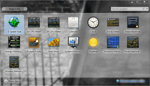
Now for how the desktop is rendered, obviously all this stuff on color is incorporated here but what's is important is more conceptual than mechanical. All Windows desktops rendered pretty much the same from Windows 95 to Windows XP. Here is a sample:

You assume that behind the start menu and the my computer window is some blue. You would be wrong. This desktop is completely 2D, and so there is NOTHING behind them. This means that each time you drag a window around the computer has to figure out what should've been behind it. Most of the time it is quick enough, but sometimes it can't keep up and you get this:

I know that is vista, but the 'aero' transparency is turned off, so it acts like xp.
Well that is unacceptable, which is why vista and 7 have transparency effects and improved rendering via a process called dwm.exe. This stands for Desktop Windows Manager, and it renders everything, even if it is hidden behind a window, this allows awesome transparency effects, like this:
If you have any questions, please ask them in the comments. Also, give suggestions for future posts.
Now for how the desktop is rendered, obviously all this stuff on color is incorporated here but what's is important is more conceptual than mechanical. All Windows desktops rendered pretty much the same from Windows 95 to Windows XP. Here is a sample:
You assume that behind the start menu and the my computer window is some blue. You would be wrong. This desktop is completely 2D, and so there is NOTHING behind them. This means that each time you drag a window around the computer has to figure out what should've been behind it. Most of the time it is quick enough, but sometimes it can't keep up and you get this:
I know that is vista, but the 'aero' transparency is turned off, so it acts like xp.
Well that is unacceptable, which is why vista and 7 have transparency effects and improved rendering via a process called dwm.exe. This stands for Desktop Windows Manager, and it renders everything, even if it is hidden behind a window, this allows awesome transparency effects, like this:
If you have any questions, please ask them in the comments. Also, give suggestions for future posts.
Subscribe to:
Posts (Atom)